J. Lyons Fund Management, Inc. Newsletter
| February 2012 |
Posted February 1, 2012 |
| Tweet |
 |
Liters or Gallons?
Using 'appropriate' measures to analyze the current rally
On July 23, 1983, Air Canada Flight 143 took off from Montreal on its way to Edmonton. About halfway through its flight, at an altitude of 41,000 feet, it ran out of fuel. Miraculously, without power, the crew was able to safely glide the 132-ton aircraft to an emergency landing at an abandoned Air Force base.
During the investigation into how a 767 aircraft could run out of fuel halfway through its flight, it was discovered that the fuel quantity indicator had failed. This required the crew to perform the rare task of manually calculating the amount of fuel needed to top off the tanks. At the time, Canada was in the process of converting to the metric system and the new 767s were the first planes in the fleet to be calibrated to the new system. However, the airline’s refueler records still contained calculations based on imperial units, i.e., gallons. In reality, over 20,000 liters, or 4,900 gallons, of fuel needed to be added in order to make the trip from Montreal to Edmonton. Using the refueler calculations, the crew added 4,900 liters of fuel.
Just as with the Flight 143 blunder, effective investment analysis requires accurate and appropriate measurements. We constantly emphasize the importance of using proper historical reference points when making market comparisons. Using proper historical markets for comparison purposes is important because it leads to a more relevant and accurate analysis of the current situation. Proper reference points are those historical periods which occurred at similar junctures in a market cycle as the period being compared. For example, when considering the current secular market, the most appropriate comparisons would be periods during previous secular bear markets. Comparing the behavior of this bear market to behavior during past bull markets is like comparing apples to oranges -- or liters to gallons.
One of the most often repeated and glaring examples of an erroneous, apples-to-oranges market comparison pertains to equity valuations. Many industry analysts have recently taken to arguing that stock valuations, such as price/earnings ratios, are cheap compared with historical levels. Notwithstanding the questionable effectiveness of such a valuation-based investment strategy, the mistake many of these analysts make is to compare current valuations with readings from just the past 10-20 years.
Such a “look-back” period contains the latter part of the previous secular bull market when valuations were at record-high levels and/or the first decade of the current secular bear market when valuations were just declining from those record levels. Therefore, it would be nearly impossible for current valuations not to be lower. A proper comparison of today’s valuations would require the inclusion of data from at least the previous secular bear market in order to really determine if today’s valuations are low for the type of market we are in.
In this month’s newsletter, we apply this theme in an effort to discern likely further potential upside to the current, post-October rally. Does history suggest that the ever-growing crowd of bulls is correct and a combination of vast liquidity, cheap valuations, strong corporate profits, improving economic conditions and potential sideline cash reentering the market will propel the market to new highs and beyond? Or is the evidence with the bears’ argument that overbought readings, too-optimistic sentiment, central banks losing credibility, a China hard landing and European armageddon will limit further gains to this rally?
Using appropriate historical market comparisons, we attempt to determine whether the current rally has gallons or merely liters left in its tank.
While this study is a useful exercise and provides a good investment lesson, JLFMI's actual investment decisions are based on our proprietary models. Therefore, the conclusions based on the study in this newsletter may or may not be consistent with JLFMI's actual investment posture at any given time. Additionally, the commentary here should not be taken as a recommendation to invest in any specific securities or according to any specific methodologies.
Current Rally Compared to Historical Secular Bear Market Rallies
As we have pointed out many times, the U.S. stock market has been in a secular, or long-term, bear market since 2000. Therefore, it is appropriate to compare the current rally with others that have occurred during secular bear markets. We studied the rallies which occurred during the 1929-1949, 1966-1982 and current post-2000 secular bear markets. Here is how the current rally stacks up versus the average of historical secular bear rallies:
| Gain | Duration | |
| Average Rally (Dow Jones - 1929-2012) | 33% | 5.9 months |
| Current Rally (S&P 500) | 24% | 4 months |
From its high, the current rally has covered a little over two thirds the average secular bear market rally, both in price gain and duration. Therefore, this comparison would lead us to the conclusion that, based on historical averages, it is not unreasonable to think that the current rally has further upside potential. However, as one might have expected, our comparisons do not end here. Since secular bear market conditions are not always the same, it may be useful to categorize such conditions in order to find a narrower, more useful measuring stick.
Cyclical Bull or Bear Market?
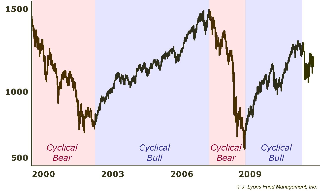
The most obvious and practical method of categorizing the rallies during secular bear markets is to break them down by cyclical market environment. Cyclical moves are shorter-term cycles within secular trends. Whereas secular trends can span multiple decades, cyclical moves last on the order of several years. These cyclical moves occur during both secular bear and secular bull markets. During secular bulls, the cyclical bull markets tend to make new highs while during secular bears, cyclical bull markets tend to make flat or lower highs.
During the current secular bear market, the market advances from 2003-2007 and 2009-2011 can be categorized as cyclical bull markets. And the declines from 2000-2003 and from 2007-2009 can be categorized as cyclical bear markets.
We thus looked at the secular bear market rallies since 1929 and categorized them by those that occurred during cyclical bull markets versus those occurring during cyclical bear markets. This distinction yielded a fairly significant difference in the results between the two categories.
| Gain | Duration | |
| Average Rally Within Cyclical Bull Markets | 44% | 9 months |
| Average Rally Within Cyclical Bear Markets | 21% | 2.6 months |
| Current Rally | 24% | 4 months |
On average, rallies during cyclical bulls gained twice as much and lasted over three times as long as those occurring during cyclical bears. The next logical step, therefore, is to identify whether we are currently in a cyclical bull or bear environment. If it is a bull, then the current rally may still have significant potential upside left, having merely covered half of the historical average of such rallies. On the other hand, if we are in a cyclical bear market, this rally's days may be numbered since it has already exceeded the average of cyclical bear rallies. So which is it?
We argued in last month's Secular Bear Market Update that the post-2009 cyclical bull market was likely over. However, as evidenced by the unshaded portion on the far right of the Secular Bear Market chart above, we will concede that the jury is still out. Although in hindsight it is easy to identify cyclical bull and bear markets, it often is not as clear-cut when considering the present market. This is especially true during either flat or volatile periods in the market when the sideways action makes it difficult to determine whether a change in trend is taking place or merely a consolidation before resuming its previous trend.
It is particularly the case when considering market tops which tend to be more gradual processes than the abrupt reversals that stand out on a chart and which tend to mark bottoms. Unfortunately, in the present case, the task is to decipher whether the action this past fall marked an end to the cyclical bull or merely a pause in the uptrend.
As is always the case, it is best to identify or develop objective criteria for making investment determinations. That way, one can combat the subjective forces of human nature which often work to cloud or subvert investment decisions. It is also often the case that the simpler the better when it comes to investment matters. The less interpretation that is involved, the less we humans can screw things up.
With that said, we offer two methods below for identifying cyclical turning points in the market:
- Trendlines - Illustrated by the solid red lines in the charts below, up trendlines are simply straight lines that connect successive market lows and provide support to an uptrend by "pushing" prices higher. They are easy to interpret as once prices fall below the trendline, the uptrend has been broken. There is some subjectivity involved however since, at times, a trendline can break only to have the uptrend resume again and thus necessitate a new trendline be drawn.
- MACD - Illustrated by the blue lines in the charts below, the MACD stands for Moving Average Convergence Divergence. It is a popular price-based indicator that combines moving averages of different length in order to measure momentum. It can also be used to identify turning points in the market when the MACD crosses a moving average, or signal line, of the MACD. This signal line is illustrated by the dotted red lines vacillating around the MACD in the charts below. At times, the MACD can whiplash above and below the signal line, creating short-term ambiguity in its readings.
Looking back at previous secular bear markets, we illustrate how these two tools have been quite effective in identifying breaks in cyclical bull markets and the initiation of subsequent cyclical bears. First, the secular bear market from 1929 to 1949.
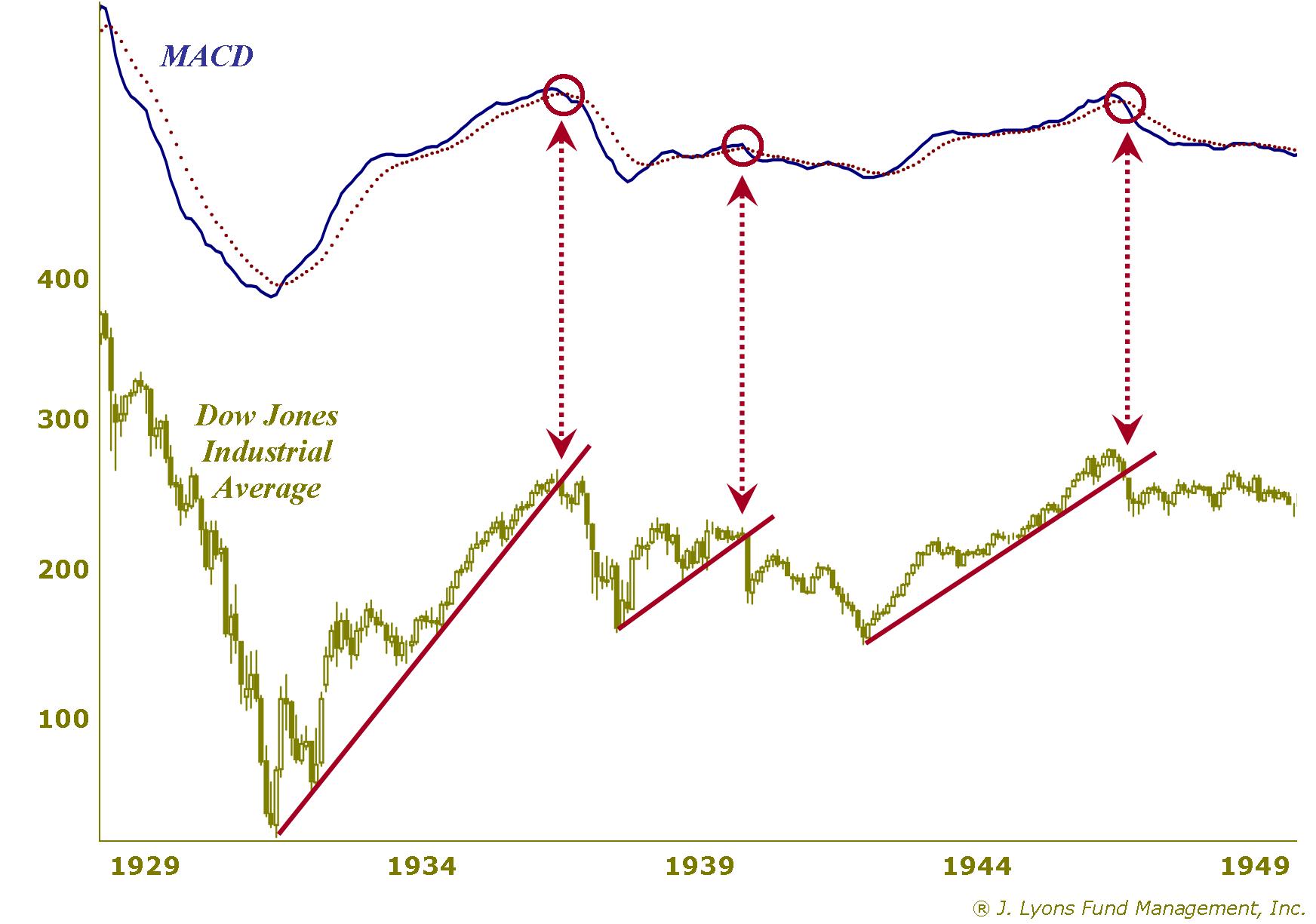
Note how effective the trendlines and MACDs were in identifying cyclical bull breaks. The signals were followed by either declines or protracted sideways markets. Furthermore, their signals coincided nearly perfectly with each other. Confirmation from multiple indicators always lends more confidence to the signal or interpretation being considered.
Here is the 1966-1982 secular bear market.
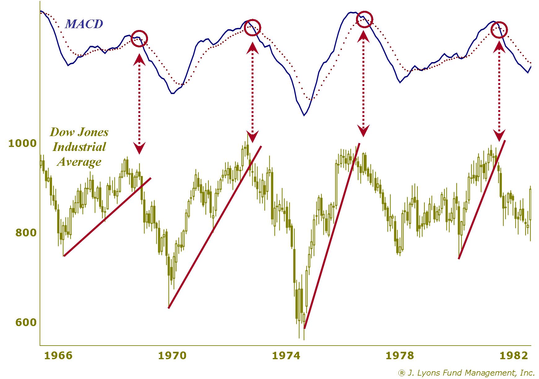
Once again, the trendline breaks and the MACD signals occurred almost simultaneously and were again effective in signaling an end to the cyclical bull markets. So, at least during the previous two secular bear markets, these techniques worked well in determining when a cyclical bull ended and a cyclical bear commenced.
If their effectiveness continued during the current secular bear, they could potentially aid us in identifying whether we were currently in a cyclical bull or bear market. Thus, we would have a better idea regarding whether we should be optimistic about a further continuation of this rally or if we should ratchet back our expectations.
Let's look at the current secular bear market.
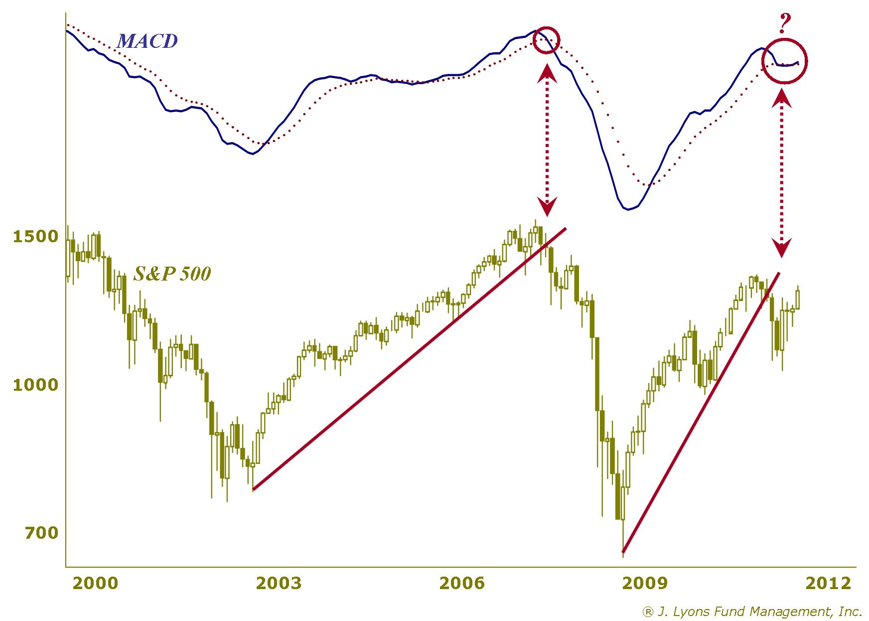
The break of the trendline at the end of 2007 along with the sharp breakdown of the MACD at the same time provided a clear signal that that cyclical bull market was over. Unfortunately, the current situation is not as clear-cut. While the trendline was clearly broken to the downside this past fall, the MACD is currently in limbo. The indicator is resting right on its signal line and really could go either way.
A similar situation occurred in 2005 when the trendline was barely broken and the MACD slightly broke below its signal line. The market eventually resumed its uptrend and a new up trendline had to be drawn, lasting until the decisive break a few years later in 2007. Will this market be a repeat of that event? Or is the MACD simply pausing before it resumes its descent, joining the trendline break in signaling the end of the post-2009 cyclical bull?
Our guess is that the next decisive move, up or down, will determine the fate of the MACD, the cyclical bull and the current rally. If we had to assign odds, we might put them at 70/30 that this past fall marked the end of the cyclical bull and that the current rally is within a new cyclical bear market. Although the market, as measured by the S&P 500 or Dow Jones Industrial Average, continues to move closer to its highs of last summer, many of the more broad indices are still far below their summer peaks. Unless this market breaks out decisively to new highs, we have to lean toward the cyclical bear camp. And if that is the case, then the current rally is likely much closer to the end than the beginning, or even middle.
Conclusion
Investment Principle
As in many areas of life, from baking a cake to refueling a 767, effective investment analysis requires accurate measures. This includes using the proper reference points when making historical market comparisons. Doing so will result in a more accurate, and potentially profitable, analysis of the market. In analyzing the current secular bear market, for instance, it is imperative that any comparisons include data from previous secular bear markets. Failure to do so can lead to faulty conclusions and investment losses. For example, any conclusion that stock valuations are cheap that does not include the 1966-1982 secular bear market in its analysis is faulty. Relying on this analysis can result in a cheap $30 stock becoming a really cheap $5 stock.
Market Analysis
Using the appropriate comparisons of prior secular bear markets, we analyzed the potential upside of the current rally. The current rally has advanced approximately two thirds that of the average historical secular bear market rally. However, breaking down the historical comparison into secular bear market rallies within cyclical bull markets versus cyclical bear markets yields a stark difference in the average performance between the two categories. The average rally during cyclical bulls went twice as far and lasted three times as long as the average rally during cyclical bears.
We used some basic but historically-effective tools to determine whether the current environment should be categorized in the cyclical bull or cyclical bear camp. While that part of the study is still inconclusive, the data does lean toward the cyclical bear camp. If that is indeed accurate, the current rally has perhaps merely liters left in its tank as it has already slightly exceeded the average historical cyclical bear rally. That is in contrast to the gallons it might have left if we were instead still in a cyclical bull market and the rally was only halfway to the average of all such historical rallies.
Ominously, if the characterization of the current market as a cyclical bear market is correct, attention will soon turn to analyzing historical declines during cyclical bear markets within secular bear markets. And those declines tend to drop like a 132-ton 767 with no fuel.
Dana LyonsVice President
The
commentary
included in this newsletter is provided for informational purposes
only. It does not constitute a recommendation to invest in any
specific investment product or service. Proper due diligence should be
performed before
investing in any investment vehicle. There is a risk of loss involved
in
all investments.
| Tweet |
|
